
Some of the most rewarding client collaborations come from supporting longer-term relationships.
Work often resonates with our team for various reasons; engaging stakeholders, enjoyable workshops, productive collaborations or having an immediate impact. However, when it’s already several of those things, and the project takes on extra relevance with what’s happening around us in the news, it can quickly feel that bit more important.
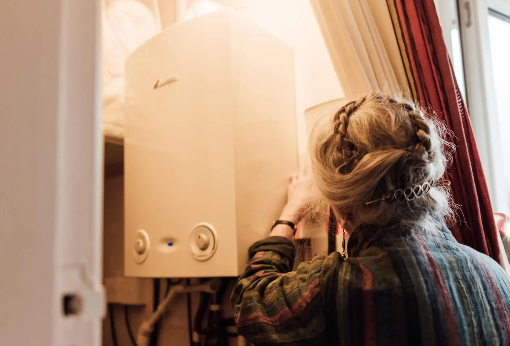
For the National Energy Foundation and many similar organisations, the energy crisis places focus on how best to present the available support. While their charitable activity always hinged on building relationships between users and their services. Having a sense of what was coming with energy price rises meant they could better prepare for a change in engagement levels, choosing to redesign some of their web properties with the issues their visitors faced in mind.
Working with the National Energy Foundation on the Better Homes Better Health (BHBH) and SuperHomes website builds presented two of those ‘important’ projects back to back. With the cost of living crisis in full swing and Gas and Electricity bills already skyrocketing, there’s been an awareness since we started work in 2021 that these two websites would reflect the natural range in how people in the UK would be confronting issues around energy consumption. With the recent price cap (interesting choice of words) announcement, we wanted to reflect on our collaboration with NEF and hopefully shine a light on their fantastic work and the services their projects provide.
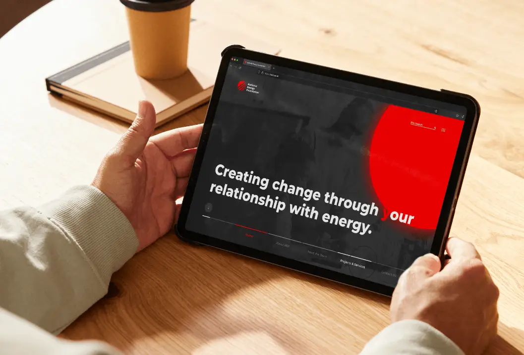
The National Energy Foundation Website: Leaning into the bold aspects of their visual identity
Like many charitable organisations, the success of SuperHomes and BHBH is contingent on establishing a clear route to engaging and activating their user ships. Therefore, Makilo needed to provide two approaches suitable for audiences coming at a similar problem from very different perspectives.
SuperHomes sought to grow a membership network of homeowners, comfortable but looking to build energy efficiency into their households (with best practices in mind and the luxury of time on their side). Conversely, BHBH needed an efficient and scalable route to get advice and support around affordable domestic warmth and rising costs into the hands of residents needing help and advice as quickly as possible.
Prospective clients frequently come to us asking if we can ‘refresh’ a website. While we can, saying no, and then taking the time to evaluate the desire for a ‘quick fix’ often reveals quite a lot about how to best address their overall strategy in a more proactive way.
For SuperHomes the level of awareness around environmental issues and, by extension, the public role in addressing the climate crisis have now made the project feel a lot less like technological foreshadowing and much more like a manifesto. However, it’s by no means an exclusive membership. Instead, we wanted to lean into the idea of inclusion, recruited ‘SuperHomers’ quickly become a vital cohort for embodying the sustainability principles many of us can still only aspire to and which factor in many of NEFs other activities.
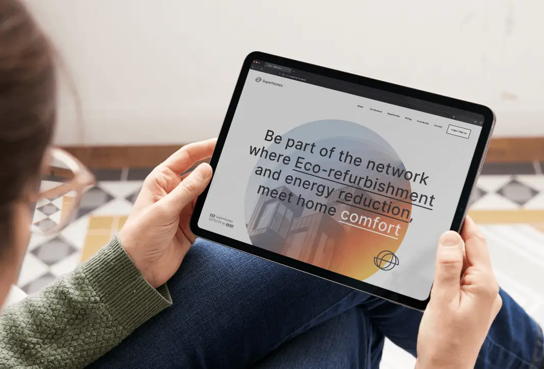
SuperHomes Website: Stripping out the filler with more a more direct identity
Reflecting on those aspirational motivations and foregrounding leaders and first movers in the ‘home retrofit’ space willing to share their experience, skills and connections to website visitors is now the cornerstone of reaching out and enlarging the SuperHomes Movement’s footprint in the UK. Presenting a new identity that felt relatable, in particular through the achievable mood of the imagery inside a more formal contemporary layout, a deliberate motif we agreed would provide a more accessible path to recruitment.
By reworking the Visual Identity of SuperHomes alongside their approaches to manage digital memberships. The organisation saw growth in paying members to over 200 in the space of 6 months. Validating a new approach with a clear ROI.
For Better Homes Better Health (BHBH), we had to remove that sense of posturing. Instead, the point of contact was a crucial moment for site visitors, ‘Am I in the right place?’, ‘Is this what I need?’, ‘Do I recognise how to engage?’ Addressing all these questions quickly before presenting two clear routes for residents to access the organisation’s services was vital.
Specifically, doing so in a way that better catered to the context in which visitors might arrive. The first is residents wanting to self-refer, those website users whose experience hinges on the need to recognise circumstances around health, personal finance and domestic comfort and how it impacts their households. The visuals selected were reassuring enough that users felt able to take steps to engage with BHBH.
The second concern was the need for partner organisations, local authorities, and support networks to efficiently refer residents needing help but unable to act themselves. Here, the design and development required establishing a balance between direct service delivery and an approachable outlook around the sensitivity of an issue that until recently was rarely discussed openly. Again, time to unpack that working process and how users and staff might make better use of the website was invaluable in implementing positive changes using the website. Until then, any aesthetic improvement felt like it might make a difference.
BHBH have since been able to expand their program of support to several other regions, extending service delivery to 7 new locations including Northamptonshire, Leicestershire, Essex, Bedfordshire, Hertfordshire, Norfolk and Cambridgeshire.
For both SuperHomes and BHBH, a vital step in responding to recent events was giving themselves the room early on in their design and development projects to reflect on their expertise and existing experiences with their end users, residents/homeowners. Recognising the benefits of responding to the changes in energy prices through the context they were confronting, rather than the organisations’ own circumstances, provided direction, vastly improving outcomes. Then, by commissioning creative that spoke to that situation, both had more time to focus on the important stuff – preparing service delivery for those who needed it.
If you or anyone you know is looking for help and support around energy-related issues, please reach out using the links below; the teams at each really can help make a difference.
For help and support during the current cost of living crisis – Better Housing Better Health
For ways you can improve the energy efficiency of your home – SuperHomes
For further information on the activities of the National Energy Foundation
If you’re serious about taking the time to assess the role creative strategy and development could play in your organisation then talk to us about our Creative Development service.

